Wednesday, 16 February 2011
Evaluation
For this project we were set the task of taking professional standard shots of a band from the second year music course. After hearing a pitch from all the bands we decided to choose ‘The Morphs’. We sat down together and put together a show reel of our work and possible pictures we could create to give them an idea of what our skills are as well as to give them more ideas of what they would have liked for their photo shoot. We proposed quite abstract ideas such as the work of Paul M Smith who uses photo shop to duplicate himself many times in to a photo which the band found really interesting; they suggested a strong idea that they had about shooting inside a red phone box. Due to missing attendance from both me and Lucy as well not having any time out of the set classes to work together we didn’t plan our studio shoot which meant we had to improvise shots as we went; this didn’t necessarily affect the quality of the shots but if we had fully planned I think we could have come up with really interesting pictures for the band. However we made up for this on our location shoot; unfortunately Lucy had a university interview but we spoken previously to make sure we got some good shots. I started at the red phone box on St. Helens street with a rough idea in my head of different shots to get and the band were very easy to work with doing what I said as well as putting forward their own ideas. The only problem with this was it was on a busy street and because the phone box took up half the space I had to stand in the road to take most of the shots as not to get in the way of passers by; luckily their wasn’t much traffic so it wasn’t too much of an inconvenience. For the second location we went to Argyle Street where the band practices with our original idea of having a Paul M Smith style shoot which involved the band playing with them also being the crowd. This was a problem though as I had to stand so far back to get the band as well as a crowd in shot the forefront of them playing isn’t very clear. Also when I got back to edit the pictures we realised that the lighting was poor and with no time left to re-shoot we had to just edit what we already had. However I feel that our spread came out very well, even with the missed time as a pair we still created a semi-professional looking piece and with Lucy’s editing the pictures we had fit in really well. If we had to re-do the project I think that we could produce something to a professional standard as we both had absence during the times we had to plan/edit or shoot.


Examples of Indie band photo shoots


All of the shots are quite abstract with a lot of colour to make them more vibrant; this makes the shots more interesting and eye catching. We wish to use this style in our shoot as it reflects the nature of the band.
Shooting Schedule
Shoot one
Location: Photography studio, Suffolk New College


Location: Photography studio, Suffolk New College

Time: 13:30-15:00
Props: None
Number of crew: 5 band members + 2 photographers
Shoot two
Location: Argyle street/ St. Helens street
Props: None
Number of crew: 5 band members + 2 photographers
Shoot two
Location: Argyle street/ St. Helens street

Time: 10:00-12:00
Props: None
Number of crew: 5 band members + 1 photographer
Props: None
Number of crew: 5 band members + 1 photographer
Annie Leibovitz
Born in 1949 Annie Leibovitz is a famous portrait photographer who has a vast collection of work spanning decades; shooting such artists and actors as George Clooney, Angelina Jolie, The White Stripes and John Lennon. She is known for being extravagant with her pictures, often very expensive she has became a must work with artist from her amazing portraits. In 1970 she approached Jann Wenner the founding editor of Rolling Stone magazine; so Impressed with her portfolio he gave Annie her first assignment: shoot John Lennon. Leibovitz’s black-and-white portrait of the shaggy-looking Beatle graced the cover of the January 21, 1971 issue. Two years later she was named Rolling Stone chief photographer. By the time she left the magazine, 10 years later, she had shot 142 covers. In 1983 she joined Vanity Fair magazine and in 1998 she also began working for Vogue. In addition to her magazine editorial work she has created influential advertising campaigns for American Express and the Gap and has contributed frequently to the Got Milk? campaign. Here are a few examples of her work…


These are my favourite images because they are so surreal and exciting; they stretch the definition of portrait with her strange and fictional style shoots.
However she also has other powerful images that are more standard portrait style, so rather than the special effects and mad scenes it is just her and the act.
However she also has other powerful images that are more standard portrait style, so rather than the special effects and mad scenes it is just her and the act.


These are a complete contrast to her other portraits, they show the artists in a very raw way. With no manic backgrounds or effects just simple portrait photography. The John Lennon and Yoko Ono portrait was shot in 1980 when they had recently released their album “Double Fantasy.” For the portrait Leibovitz imagined that the two would pose together nude in which Lennon agreed but Ono refused to take off her pants. Leibovitz “was kinda disappointed,” according to Rolling Stone and so she told Ono to leave her clothes on. “We took one Polaroid,” said Leibovitz, “and the three of us knew it was profound right away.” The portrait shows Lennon nude and curled around a fully clothed Ono. Several hours later, Lennon was shot dead in front of his apartment. The photograph ran on the cover of the Rolling Stone Lennon commemorative issue. In 2005 the American Society of Magazine Editors named it the best magazine cover from the past 40 years.
Anton Corbijn
Born in 1955 in Holland. His career of music photographer began when he saw the Dutch musician Herman Brood playing at a cafe around 1975. Inspired by the musicians he had photographed he moved to London where he found immediate contact with the most popular bands and artists of the time such as Post Punk, Joy Division, Magazine amongst others. Vogue, Rolling Stones, Details, Icon, The Independent Magazine, W Magazine, Harpers Bazaar, LA Style
After 1985 he mainly photographed only people involved in show business, photographing for a vast collection of magazines such as Vogue, Rolling Stones, Details, Icon, The Independent Magazine, W Magazine, LA style and more where some of the first portraits of now global superstars appeared like the Rolling Stones and Depeche Mode.


The Killers

U2
Elvis Costello
After 1985 he mainly photographed only people involved in show business, photographing for a vast collection of magazines such as Vogue, Rolling Stones, Details, Icon, The Independent Magazine, W Magazine, LA style and more where some of the first portraits of now global superstars appeared like the Rolling Stones and Depeche Mode.
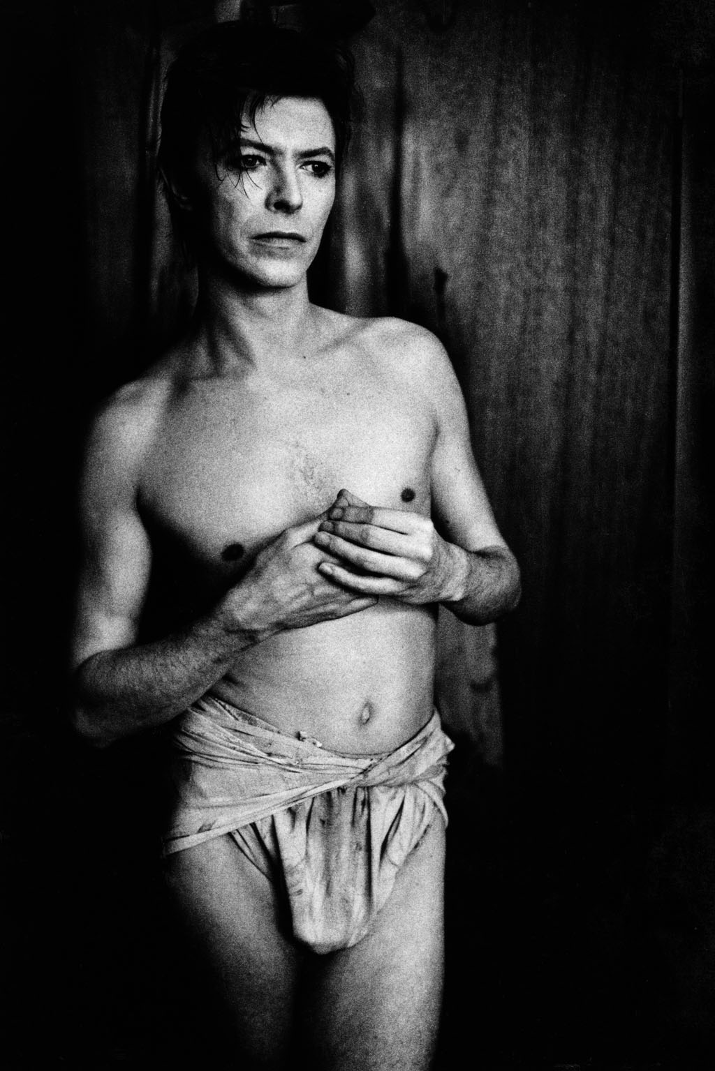

All of the pictures have a surreal element to them. For example the David Bowie portrait it is as if Bowie is supposed to be Jesus in the way he is dressed; which makes a seemingly ordinary piece seem much more meaningful and interesting.
His pictures are all usually shot in either black and white or through a filter so they never contain vibrant colours. This gives the pictures an antique kind of feel which seems to add importance to the pictures.
His pictures are all usually shot in either black and white or through a filter so they never contain vibrant colours. This gives the pictures an antique kind of feel which seems to add importance to the pictures.
Here are some more examples of his work:

The Killers

U2
Mick Jagger & Keith Richards (Rolling Stones) 

Elvis Costello

All of the portraits show the artists in a calm scenario far removed from their usual lifestyles, this is also reflected in the lack of any colour. This style really appeals to me because even if the pictures were just taken it gives them a classic feel as if these photos will be remembered as part of the bands image during their career.
Layout research
For my double page spread I want to keep it fairly simple not involving too much going on as it is an aesthetical piece with the photos and background but the text needs to remain clear and concise. I want to integrate the photos in to the piece rather than it being in a box as this leaves more space for text and makes the whole piece look more professional and flowing. These are a few examples of possible layouts.


Subscribe to:
Comments (Atom)